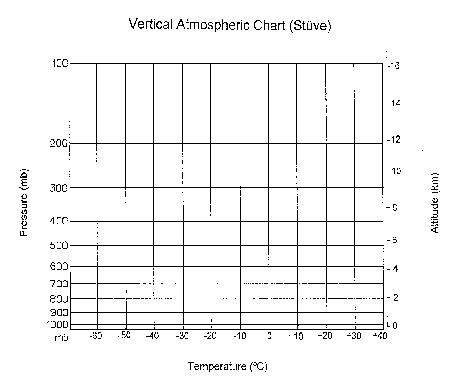
 Pressure-Temperature
The thermodynamic diagram is a tool frequently used by meteorologists to solve atmospheric temperature and humidity problems using simple graphical techniques. Lengthy calculations are avoided since the mathematical relationships have been accounted for in the arrangement of this diagram. Meteorologists use the thermodynamic diagram daily to forecast cloud height and atmospheric stability, the latter of which is an indicator of the probability of severe weather. They base their analyses upon the plots of the vertical profiles of air temperature, humidity and wind that are observed by a radiosonde (a balloon-borne instrument package with radio transmitter) at individual upper air stations.
One version of the thermodynamic diagram is the Stüve, so named for its inventor.
The complete thermodynamic diagram contains five sets of lines or curves:
The pressure and temperature uniquely define the thermodynamic state of an air parcel (an imaginary balloon) of unit mass at any time. Horizontal and vertical lines for pressure and temperature are the same as in the simplified chart described above; on a color monitor they will appear as solid blue lines. The horizontal lines represent isobars and the vertical lines describe isotherms. These two quantities serve as the primary coordinates of the thermodynamic diagram because they uniquely define the thermodynamic state of an air parcel (an imaginary balloon) of unit mass at any time. The altitude of the parcel is of secondary consideration, because its pressure, and any subsequent changes in pressure, are more important for determining the changes in the state of the parcel.
An additional scale is provided along the side to approximate the geometric altitude of various pressure levels, using a typical, reference atmosphere.
You can locate a parcel's position on the chart with respect to the temperature and pressure lines. For example, we can locate a parcel that has a temperature of 20°C and a pressure of 900 mb. A point (P,T) on the chart does not necessarily have to fall on these reference lines. You can always interpolate , or draw in all these lines through that point as long as you keep them parallel to the reference lines! You should note that the values of pressure decrease from bottom to top and that the non-uniform spacing reflects the manner in which the pressure changes with height in the real atmosphere. For completeness, the dewpoint temperature of the parcel (Td) can be plotted upon the diagram at the same pressure level.
The straight, solid, green lines sloping upward to the left on the diagram are called "dry adiabats". These lines represent the change in temperature that an unsaturated air parcel would undergo if moved up and down in the atmosphere and allowed to expand or become compressed (in a dry adiabatic process) because of the air pressure change in the vertical. If you would lift an air parcel from a known initial point to a final point, you would trace the amount of cooling on the nearest dry adiabat.
The set of dashed light blue curves are "saturation adiabats". These curves portray the temperature changes that occur upon a saturated air parcel when vertically displaced. Saturation adiabats appear on the thermodynamic diagram as a set of curves with slopes ranging from 0.2C°/100 m in warm air near the surface to that approaching the dry adiabats (1C°/100 m) in cold air aloft. These curves portray the temperature changes that occur upon a saturated air parcel when lifted.
A last set of yellow dash-dotted curves appearing on the thermodynamic diagram is needed to assess the moisture characteristics of an air parcel. These lines (also called saturation mixing ratio lines) uniquely define the maximum amount of water vapor that could be held in the atmosphere (saturation mixing ratio) for each combination of temperature and pressure. Recall that the mixing ratio is defined as the mass of water vapor per mass of dry air, expressed as grams of vapor per kilogram of dry air. These lines can be used to determine whether the parcel were saturated or not. If the temperature and the pressure of an air parcel are known, the parcel's saturation mixing ratio can be read directly from the chart using the set of saturation mixing ratio lines. Suppose we had an air parcel with a temperature equal to 26°C and a pressure of 1000 mb, then the saturation mixing ratio is 20 g H2O/ kg dry air.
We can also determine the actual mixing ratio of the air parcel from this same set of lines if the dewpoint temperature were known also. If we know the pressure and both the air and dewpoint temperatures, we can determine the saturation mixing ratio and w, respectively. Thus, from the above example of an air parcel with T = 26°C and P = 1000 mb, and a dewpoint, Td equal to 15°C, then the saturation mixing ratio is 20 g/kg and actual mixing ratio = 10 g/kg.
The thermodynamic diagram is used to display temperature, moisture and wind profiles that are produced from a sounding of the atmosphere. A plot of the vertical temperature data from an instrument sounding of the atmosphere becomes a vertical continuous temperature profile when the data points are connected by straight line segments. Similarly, the dewpoint profile is produced. Additional RAOB data are organized, computed and tabulated.
Now we are ready for a real sounding plot. Call up a current sounding for a nearby RAOB station . You will note that this sounding has two profiles, as indicated by solid line segments. The right hand profile represents air temperature, while the left hand profile represents dewpoint, a measure of atmospheric humidity. The two curves may touch (indicating saturation conditions), but never cross, because the dewpoint temperature rarely exceeds the air temperature.
Along the right hand margin of the diagram are plots of the wind direction and wind speed for various heights, using the same standard wind arrow and wind barb configuration as in the surface station model.
The nine lines of data entries in the upper right hand corner refer to various indicators determined for the given sounding to assess total moisture and atmospheric stability. These variables will not be considered here.
The thermodynamic diagrams help the meteorologist quickly interpret the vertical temperature, humidity and wind structure of the atmosphere above a given locale.
In the troposphere, the temperature usually decreases with altitude, as indicated by the plot of the Standard Atmosphere, an average vertical structure of the atmosphere. However, on any particular day, the temperature profile obtained from the radiosonde sounding could depart significantly from this reference, especially in the lower troposphere. Two other temperature profile patterns can exist. If the environmental temperature increases as the height increases, then that layer is called an "inversion". If the temperature remains constant as the height increases, then that layer is called an "isothermal layer".
The height of the tropopause, a seasonally and latitudinally variable boundary between the troposphere and stratosphere, can be determined from the plotted sounding. Usually this height is defined as the lowest point where the temperature profile becomes isothermal or develops an inversion over an extended layer; typically this level occurs somewhere between 6 km in polar regions and 16 km in the tropics.
The typical dewpoint profile also decreases in the lower atmosphere, as one moves away from the surface where water is usually more available. A region of the dewpoint profile that is within several degrees of the air temperature profile would indicate a possible cloud or a low level fog, since the layer would be close to saturation with respect to water vapor. If a radiosonde ascends through a cloud, the dewpoint profile could increase.
The vertical wind profile plotted along the side of the diagram often shows that the wind speed increases from the surface upward through the lower atmosphere. The increase in wind speed in the lowest 100 mb of the earth's surface typically results from the diminishing effects of surface friction that retards the surface wind speed. Strong winds near the upper part of the chart-above 400 mb typically would indicate the upper tropospheric jet stream.
The wind direction may change with height. In the lowest 100 mb of the atmosphere, the winds tend to "veer", or turn in a clockwise direction with height, because of the decreased effects of friction. Above this level, changes in the wind direction are related to horizontal differences in air temperature. If the winds veer with weight, warm air would be expected to move into the region. However, if the winds "backed" with height (turning in a counterclockwise direction with height), cold air would be anticipated.
Last revision 10 June 1996
© Copyright, 1996 Edward J. Hopkins, Ph.D. hopkins@meteor.wisc.eduMaster Links Page / Current Weather Page /ATM OCN 100 Home Page /AOS Dept. Home Page
 Dry adiabat plot
 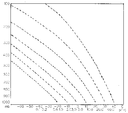 Saturation adiabat plot
 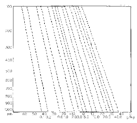 Isohume plot